
LUMA CAFE
BRAND IDENTITY | STRATEGY
Luma is a wellness beverage brand that offers uncaffeinated morning drinks made with clean, natural ingredients. The brand centers on the idea of beginning the day with light, clarity, and calm energy. Inspired by the Latin word for “light,” Luma’s visual identity uses soft natural tones, minimal typography, and simple design elements to create a sense of peace and renewal. The final brand system includes a clean logo, soothing color palette, and cohesive layouts that communicate warmth and mindfulness. Every element reinforces Luma’s values of purity, balance, and brightness, resulting in a modern and inviting identity that helps people start their mornings feeling refreshed and grounded.

THE BRAND STRATEGY
The branding strategy for Luma Cafe was built around the idea of creating a morning space that feels calm, intentional, and restorative. The first step was defining the brand’s purpose, which centers on offering uncaffeinated drinks made with clean ingredients for people who want to start their day with clarity rather than urgency. This foundation led to identifying core themes of light, ease, and balance, which shaped every decision in the visual and verbal identity. Research included studying morning routines, analyzing competitors in both wellness and cafe markets, and identifying emotional drivers behind why people seek slower, more mindful mornings.
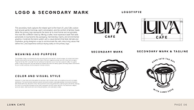
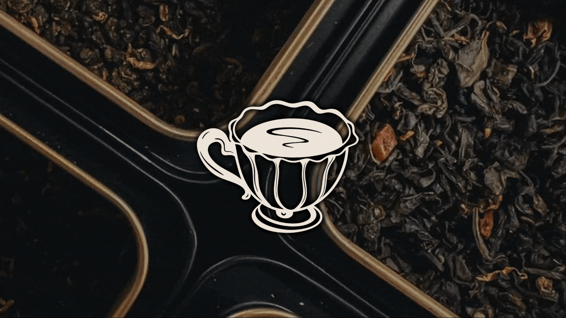
With this understanding, the brand personality was developed to feel warm, gentle, and quietly confident. The name Luma was chosen for its connection to light and subtle brightness, reflecting the brand’s role in helping customers ease into the day. From there, the visual system was built to express calm simplicity through a soft monochromatic palette of deep blacks, stone grays, warm creams, and clean whites. Typography was selected to balance refinement with approachability, creating a voice that feels clear and soothing. Photography direction emphasized natural light, minimal compositions, and peaceful morning rituals. Illustrative elements, including the secondary vintage cup mark, added character and reinforced the brand’s slower-paced, comforting tone.
Finally, messaging and taglines were shaped to reinforce the emotional promise of Luma: a place for gentle beginnings and mindful transitions. Phrases focus on ease, presence, and small moments of peace. Every element of the strategy works together to create a cohesive brand that supports the customer’s desire to start their day with intention.


THE COLORS
The Luma Cafe color palette brings together a full range of tones that create a calm, modern, and thoughtfully layered visual identity. The darkest shade provides structure and depth, giving the brand a grounded and confident foundation. The warm mid-tone neutrals add balance and softness, creating an approachable and comforting atmosphere that reflects the ease of a slow morning. The light cream tone introduces gentle warmth and a sense of natural daylight, supporting the brand’s focus on clarity and calm. The pure white offers openness and simplicity, acting as a clean backdrop that allows other elements to shine. The secondary tones expand the palette with subtle variations of gray and taupe, offering flexibility while maintaining cohesion. Together, these colors create a system that feels serene, intentional, and timeless, reinforcing Luma Cafe’s promise of peaceful beginnings and mindful moments.

THE PATTERNS
The primary pattern is a bold, abstract flow design created using the brand’s Deep Black and Soft Stone tones. Its organic lines mimic the gentle movement of morning light, the soft rhythm of a slow start to the day, and the swirling motion seen when creamer blends into a warm drink. These fluid shapes introduce a sense of warmth and calm while adding visual depth to the brand system. The pattern is used to create contrast and mood, often appearing on packaging interiors, merchandise accents, and digital backgrounds. It brings an elevated, artistic touch to the identity and reinforces the idea of easing into the day through smooth, unhurried energy.
This secondary pattern features hand-drawn illustrations of mugs, vintage cups, croissants, and citrus slices, all arranged in a playful yet refined repeat. Set on the warm Morning Cream background, the pattern reflects the heart of Luma Cafe: simple pleasures, comforting rituals, and the joy of starting the day with something nourishing. The illustrations maintain a clean, minimal line quality that pairs seamlessly with the typography and color palette. This pattern is used in lighter, more approachable applications such as pastry bags, menu covers, tissue wrap, and promotional materials. It adds personality and charm to the brand, strengthening the connection between Luma’s offerings and the gentle experience it promises.


